Showing posts with label trend. Show all posts

6.1.14

An instant journey to the small history of Phoebe Philo's creation in Céline is much more nostalgic than I think. 

Spring 2014

The editors and buyers, as well as customers, are praising Phoebe Philo over and over again, for what she crafts under the French house, Céline. I, on the other hand, have had difficulties channeling myself to the house's creation, as it exudes--pardon my word--awkward simplicity I cannot bring myself to. So here is my attempt to get acquainted at mere seconds to the world of Céline, the Philo reigning period to be exact, by extracting my favourite looks/pieces from several seasons of the brand and imagining myself having limitless bank account so I can have them in my closet. That way, I assume, would help me appreciate Philo's aesthetics that somewhat empowers women through what they wear. After all, credits for Céline almost always contain the words versatile, accessible, simple and relate-able if not luxurious and modern.

First up is the blues
Fall 2013/ Spring 2010

Black and white are the utmost neutral of the color spectrum: the safest bet and the easiest to pair. True. Nevertheless for me, blue is the most versatile. Not only the colour has numerous shades, it also complements various skin tones and is able to deliver fun, feminine and powerful at the same time. Philo adopts the colour real well, given that the left look from Fall 2013 collection remains as the most inspiring (or copied, depend on how you perceive it) getup of the year. Additionally, the draped dress on the right is a definite go-to for a night out, or even for a work-related event if a blazer is thrown over.

White has shades, too
 Fall 2013/ Resort 2011

...and it is called creme. I know, I know those two colours are noticeably different, both of which are the neutrals and will always be. This time I imagine keeping myself a dress from the Fall 2013--the dress at the first glimpse appears unbelievably genius and at the second infinitely wearable. Meanwhile from the Resort 2011, the non-existent season, a slight stroke of colors on the pure white separates manages to amp up what otherwise is a sporty pairing. Must. Have.

Dark meets bright
Resort 2010/ Spring 2010

Perhaps not a lot of women fancy the pairing of light and dark back then, but now, it is everything modernism has to do. Well, probably not everything. But the cape-like top on from Céline spring collection on the right is EVERYTHING. I seriously consider that it is one of the prototype of the cape-ubiquity today, the ones designed with such airy yet structured feel. At the same token, the suit and top combo relinquishes "too uptight" once the flowing part of the top emerges. It is dark meets bright meets brilliant.

The effortless neutral
Resort 2014/ Resort 2010

If you are the ones shying away from wearing neutrals because the shades can make you appear nude, I am with you. But if you are the ones resisting oversize vest/parka like the one from resort 2010 installment, I am afraid I am not with you. Maybe it is the patchwork talking, or the oversize shape persuading, but this is an archetype of successful dressing: picking a statement outerwear that understates everything. Meanwhile, the Asian inspired top and pants from the recent 2014 collection are mere extensions of what kind of neutrals we all should be aiming for.

Unexpected is always in
Spring 2014/ Fall 2012

Lastly, after a wardrobe/retrospective/whatever full of basic colours and shapes, it is about time to let striking pieces kicking in. It is the artsy season, the spring 2014, and the watercolour dress filled with strokes of Philo's artsy inspirations is reasonable to don. The structured upper part and flowing bottom part summarise precisely the future of dress, and possibly the future of femininity. And what is fall without Céline big coat? Or at least, let's get something in similar styling. With the red pants, of course.


Images are all from style.com

8.9.13

Similarity is no new thing in fashion but what if a New York Fashion Week collection presents something similar with what local brand has designed earlier?


The fashion week has kicked off this week and I cannot be more excited to witness how trends are shaped - both inside and outside the show. This post, and this blog as a whole, however, will not attempt to deliberate each and every collection that ignites my interest as what I have been writing in the past, but rather, the fashion week review will consist of my attempt to spot any peculiarity, coincidence, and who knows, faux pas here and there. That leads to my small discovery about a brand named Misha Nonoo which has just hosted the New York Fashion Week presentation for three times this spring/summer 2014 season.

Down the runway, Misha Nonoo has cheeky, carefree and most definitely, pastel pieces that are irresistible for the feminine, yet with certain twist to it. A particular look that sets me in deja vu, however, is a short pantsuit in blue-ish, cloudy print that reminds me of what an Indonesian brand, Argyle and Oxford has in their latest offering. Note that Argyle and Oxford present their collection first, Misha Nonoo follows later.

So what is this telling us? This little coincidence is one of many proofs of how fashion has globalised. The influences can come from anywhere. The brilliant minds are not centralised in the fashion capitals only. Although cloud print is not a breakthrough by either brand, how Argyle and Oxford develops their sense of trend to pieces that design-wise is eligible to be shown on the NYFW runway (by comparing it to what Misha Nonoo presents), is worthy to think about. Maybe in years to come we will not have to benchmark all trends to the mode cities and major fashion weeks only. I vehemently believe so.


24.10.12

,

FAVOURITES | Fuck Yeah Minimal

On explaining how I have been MIA these past days, beside that some major changes happen (this time they are the good ones), is also, as you can see, that I have a trouble with the font. Times New Roman, anyone? Seriously? But salivating over a couple of cruise collections and Margiela x H&M candies, I cannot help but share. Still, I desperately need a help to handle this font catastrophe.


image sources: vogue.it, vogue.uk

White, blue, black, ostentatiously structured with little effort to find the accompanying pieces. Exactly what is on my cloudy mind right now. Life is good and I save hope for a better paycheck to spend on "investment pieces." Sound cliche, yet inevitably lust-worthy. Until then.


5.5.12

It's Saturday and I finally have a little energized time to do errands (read: post on my blog and maintain VOCIFEROUS while updating story lines of some television shows). It hasn't been a wonderful week behind me but now I am taking things slowly and trying to post here at least three times a week or more quality posts like this one, if you like to read, of course (!). Now, moving on to another matter...

As a lot of people mention that fashion is one big cycle, trends that come and go and come again and fade again with some extra touch to make it more sophisticated and in-the-moment, for these past months I have taken a note of the increasing use of pajamas as daily wear. No, not that kind of wear when you lounge around the whole day, do nothing beside sitting in front of the TV laptop and eating cereals three times a day (I am not a big fan of cereals, thus this has never happened to me). The extensive use of pajamas outside the bedroom here means that the girls seriously throw on some two-piece-set and call it a day.


Debatable, right? I guess the one that has started this fairly questionable outfit is none other than the charismatic and talented man, Ryan Gosling. He wore this blue-and-white pairing to Cannes Film Festival back then in 2011 and later on his photos are spread all over the world, call for both admiration, style debate, and unconsciously, a trend. Sure, there were definitely some periods in the past where men and women crawl from their bed and head to dinner in fancy restaurants (I probably just make this up so please bear with me) in their pajamas, but for the year 2012, I not-so-secretly believe that Gosling starts it all.

*if you haven't watched his movie, Drive, you definitely should.


I have nothing against it, really, if the look is gracefully composed, then why not? With certain elegance and rather lazy depiction, wearing pajamas for me actually takes a lot more effort than it seems. It is all about elevating the use of certain clothing items--making it multi-functional and purposely ready to serve the daily needs. The notion of styling pajamas is not that simple since there are some facets a man/woman needs to go through to make it day-appropriate. And when some day we can wear pajamas to work (I guess my occupation will allow me to do so, in one fashionable way), I will be the one of many who approve.


25.1.12

, ,

ON RADAR: Print

It is another fashion parade, the cycle that rolls every year, and this time it is menswear turn. I didn't really get the chance to browse each and every single collection but I saw these two eye-catching details that I have not expected before. Celine has clearly pioneered the use of printed blouse matched with printed pants the past season, but apparently the influence has spread.


It is Miharayasuhiro, a brand originated in Japan, that elevates the military look to a whole different level. Military prints are transformed into something polished, sharp, and youthful, accentuated with clean cutting and fitted silhouette. I have to say, it takes some guts for men to put those on, but it can give unusual touch for formal-slash-funky party.

Dries van Noten, on the other hand, takes whimsical tour with the prints, with those psychedelic drawings on the suits. I am not sure anyone can pull these offs (besides the usual fashion crowd and front-rowers, of course) since it is rather, um, wild. Domination of dark green and orange hues gives a 70s flamboyant feeling to it, putting it on a risky business of men's tailored suits.

17.1.12

,

ON RADAR: Washed

Or fade? I cannot really decide which exact word I want to use to describe series of clothes that involve two diluting colours, which complement each other perfectly. Seen this lovely shirt by Colenimo here the other day and I immediately understand that I could probably do the same thing by using similar ingredients (bleach) as the one in my previous DIY post. The subtle acid washed in white and blue gives a rather "modern vintage" feel to the shirt, infatuated by the simple cutting.


Dual colors are at their best as well in the hand of Phillip Lim, whose Spring 2012 collection for men is inspired much by skater's world. I see it as an elegant approach to rebels, especially with the acid addition. The shirts and even pants (!) look ridiculously cool, that somehow I wish more men can pull off such quirky touch instead of the ol' plain t-shirt and jeans combination.

30.12.11

, , ,

I Wore: Lime

Opted for a simple, cleaner look (as lately I have almost always opted for such silhouette) for a night out with parents and their friends (yes, their). The whole mix-and-match thingy that evening was sort of organic--took the dress as the focal piece, then found the bow inside my accessories drawer, gracefully added casual touch with flats and obviously, grabbed one of my clutches. The dress is one of my recent purchases, I can still clearly remember that day I insisted on looking for vibrant coloured skirt but instead I stumbled upon this lovely lime dress. Been thinking of other ways to pair it, most probably with blazer, jacket, or event pants :p


On a more essential note, the predicted colour of 2012 is apparently tangerine tango and you know what, it is my least flattering colour (you must have known it if you follow my twitter, promotional, I know but who else will promote me beside me?--rhetorical tone always wins, okay, almost). The orange hues are not really my best friends, wonder whether it is because of my skin tones or simply my taste. Yet, here refinery29 put together a classy colour choice for Spring, sadly, lime is not included, but every other palettes that I love are there--all sorts of pastels (cotton candy, lavender, beige), cyan (or what I call it, striking green-ish blue in its finest tone), and mint.


Have a sweet end of 2011 everyone! :)

28.10.11

Left: Angela Lindvall by Catherine Servel for Allure Korea November 2011.
Right: Kate Moss in Louis Vuitton Spring/Summer 2012.


Love both sweet styling, with just the right amount of makeup and hairdo. If you take a look closer, you can see additional feather on Lindvall's shoes and lovely feather-ish detail on Moss' dress. And I have to say, I do not expect much from Allure Korea, but they do translate the "trend" really well. Guess it's time for the Asian fashion media to offer more high fashion styling and be tastemakers (notice the Korean wave everywhere?). Anyway, hope you enjoy this repetitive one-picture-post as I really am tired after a day of work (imagine two hours driving in traffic jam everyday? I do not want to whine but that is such a bitter reality :( should really find a solution to this though..)

18.10.11

, , ,

On Radar: YELLOW

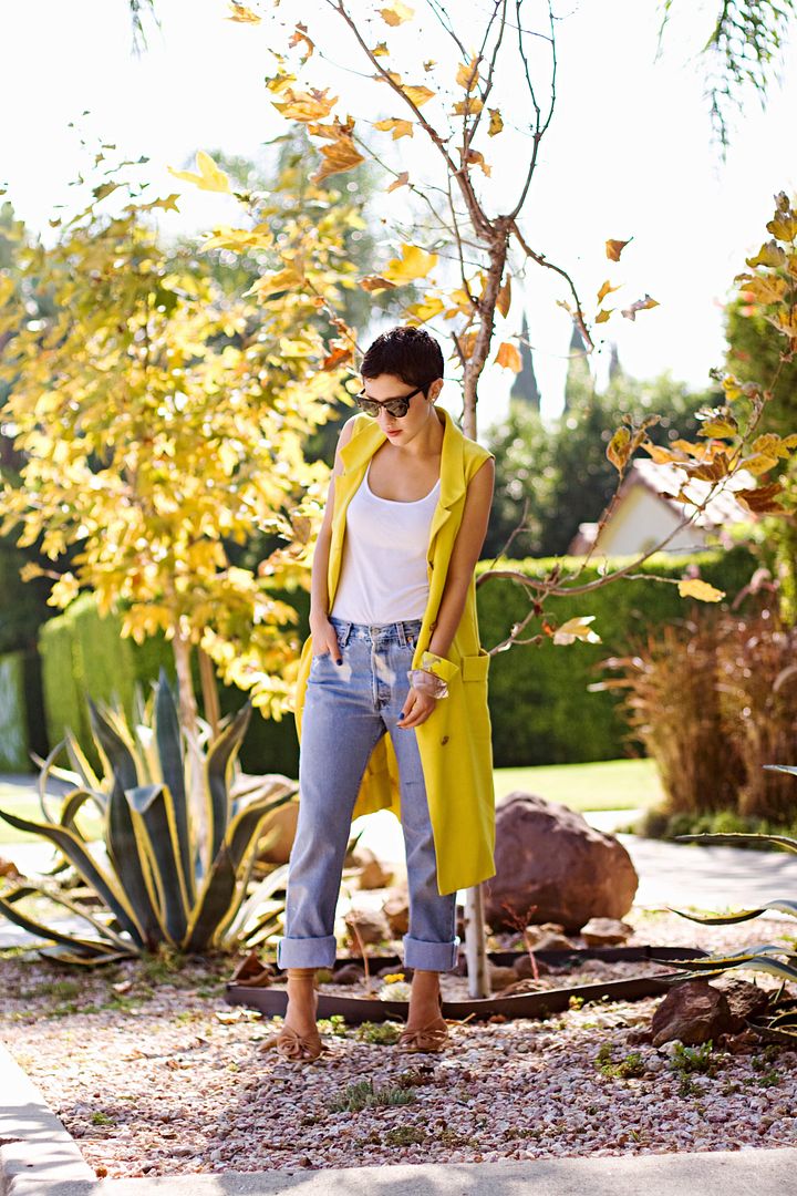
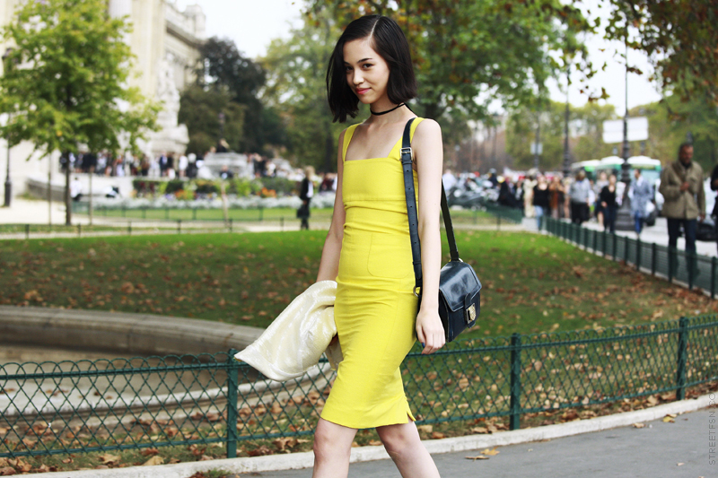
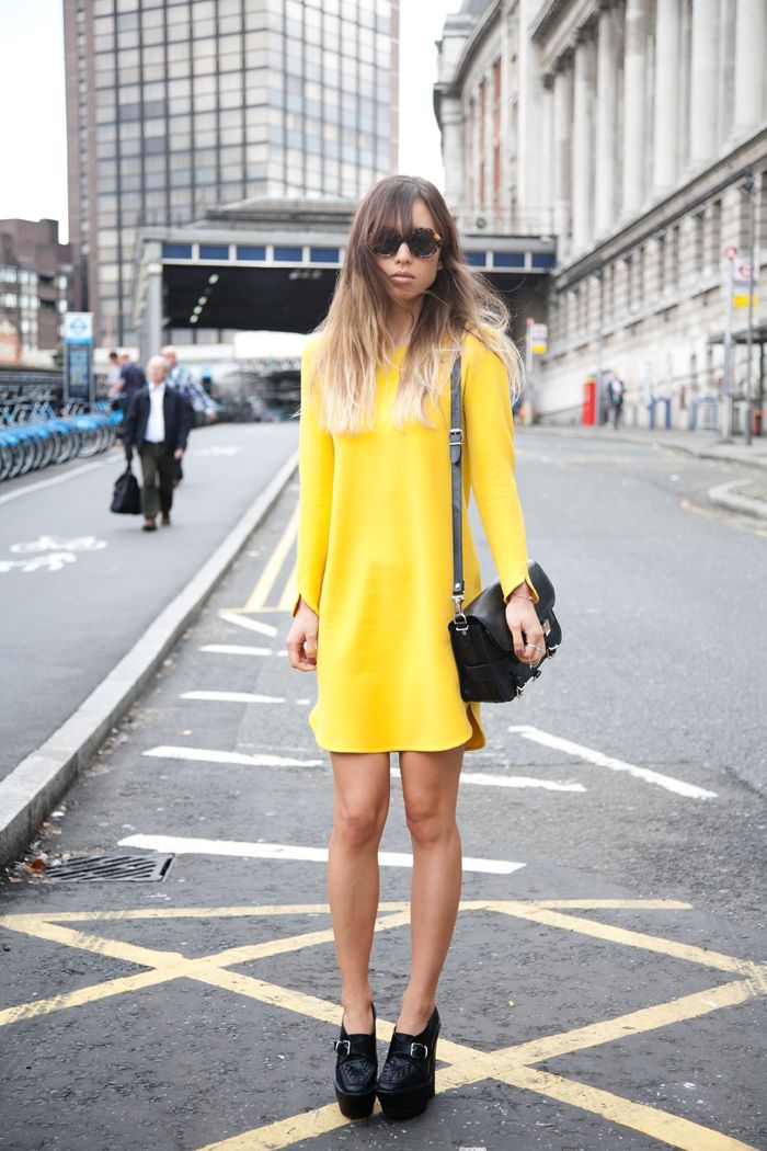
I spot yellow pops out everywhere! I am always pro to colour when it comes to an outfit, but yellow isn’t really my best friend. But seeing similar shade worn as dress and even as outwear somehow tickles me to take a look into my wardrobe and pick some old mustard-y or lemon-y yellow there. Would you like to try adding yellow to your outfit, perhaps to spice up the gloomy palette of fall? 


P.S I'm still having trouble(s) with putting the right image resolution and same size (width) here. HELP! :'(

a culture and style publication

a culture and style publication
liberate your mind!

Blog Archive

Search